Understanding CMYK
When it comes to printing, the term “CMYK” is frequently used, but not everyone fully grasps what it means or why it’s crucial. CMYK stands for Cyan, Magenta, Yellow, and Key (Black) – the four fundamental colors used in the printing process. Unlike the RGB (Red, Green, Blue) color model, which is employed for digital screens, CMYK is specifically designed for print. Understanding CMYK and how to use it correctly is key to achieving vibrant and accurate print results.
CMYK for Printing
The CMYK color model is indispensable in the world of printing. Whether you’re printing business cards, brochures, or custom packaging, the colors on your screen can look vastly different when printed if you’re not working in CMYK. This discrepancy arises because screens emit light, using the RGB model, while printers apply ink to paper, blending the CMYK colors. Ensuring that your designs are in CMYK from the start can prevent disappointing print outcomes and costly reprints.
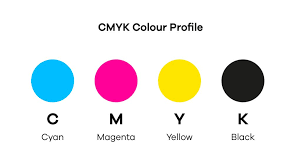
Components of CMYK
The CMYK model operates with four ink colors:
- Cyan: A greenish-blue color.
- Magenta: A purplish-red color.
- Yellow: A primary color that, when mixed with cyan and magenta, can produce a range of colors.
- Key (Black): Added to enhance the depth and detail of the printed image.
These four colors are mixed in varying degrees to create the full spectrum of colors seen in print. Unlike mixing paints, which is an additive process, CMYK uses a subtractive process where the inks reduce the brightness of the paper by absorbing light.
How CMYK Works
The CMYK process is a subtractive color model. When light hits the printed ink, certain wavelengths are absorbed (subtracted), and others are reflected, which is what we see. For example, cyan ink absorbs red light and reflects green and blue light, giving the appearance of cyan. By layering the inks in different densities, a vast range of colors can be produced.
This process is fundamentally different from how RGB works, where colors are created by adding light. In RGB, white is the combination of all colors, while in CMYK, white is essentially the absence of ink, and black is achieved by adding all colors or using black ink.
CMYK vs. RGB
One of the most common challenges in graphic design is the transition between digital and print mediums. RGB, the color model for screens, and CMYK, the model for printing, do not convert perfectly. RGB colors are often brighter and more vibrant than CMYK because they are based on light emission, not ink absorption. As a result, when an RGB design is converted to CMYK, some colors may appear duller or different than intended.
Understanding this difference is crucial when preparing designs for print. Designers need to anticipate these changes or design directly in CMYK to ensure that what they see on the screen is what they’ll get in print.
When to Use CMYK
CMYK should be used whenever the end product will be printed. This includes everything from business cards and flyers to large-scale posters and packaging. By starting your design process in CMYK, you avoid the pitfalls of color conversion and ensure that your printed materials are as accurate as possible.
Designing in CMYK is particularly important for brands that need color consistency across different printed materials. Since RGB and CMYK colors can vary, a brand’s signature colors might look different if not properly managed in the CMYK model.
Designing for CMYK Printing
When designing for CMYK printing, there are several best practices to follow. First, always begin your design in the CMYK color mode if the final output is intended for print. This helps avoid unexpected color shifts when the design is eventually printed.
Use high-resolution images and vectors to ensure clarity in the final print. Low-resolution images might look fine on screen but can appear pixelated or blurry when printed. Additionally, it’s important to avoid using pure black created by just the black ink (K) in large areas. Instead, use a “rich black” composed of a mix of CMYK inks to create a deeper, more even black.
CMYK Conversion
If you’ve designed something in RGB and need to convert it to CMYK, most design software offers a conversion option. However, this process can sometimes result in unexpected color changes. It’s essential to carefully review your design after conversion and adjust the colors as necessary to maintain the desired appearance.
When converting, keep in mind that some RGB colors cannot be replicated exactly in CMYK. These “out-of-gamut” colors may require manual tweaking to get as close as possible to the original shade.
Color Accuracy in CMYK
Achieving color accuracy in CMYK printing can be challenging, but it’s crucial for consistent results. One of the most effective ways to ensure accuracy is by using color profiles, which are standardized settings that help manage color conversion and printing.
Soft proofing, which simulates how your design will look when printed, can also be helpful. This process allows you to make adjustments before the actual printing, saving time and resources.
Common CMYK Challenges
One of the most common challenges with CMYK printing is color inconsistency. This can occur due to variations in ink, paper, or printing equipment. To mitigate this, always use high-quality inks and paper, and if possible, work with a reliable printing service that can maintain consistent standards.
Another issue is the difference in appearance between on-screen designs and printed results. This is why it’s essential to proof your designs and possibly create test prints before committing to a large print run.
Software for CMYK Printing
Several software programs are designed to handle CMYK color models and are widely used in the industry:
- Adobe Photoshop: Ideal for working with raster images and complex color adjustments.
- Adobe Illustrator: Best for vector graphics, which remain crisp at any size.
- CorelDRAW: Another vector-based program popular in the design community.
These tools offer robust options for managing CMYK colors, including profiles, soft proofing, and direct CMYK color selection.
Choosing the Right Paper
The type of paper you choose can significantly impact the final appearance of your CMYK print. Coated papers, such as gloss or matte finishes, tend to produce sharper and more vibrant images, while uncoated papers offer a softer look with less shine.
It’s also important to consider the paper’s weight and texture, as these can affect both the print quality and the perceived value of the printed material. For instance, heavy, textured paper might be ideal for luxury brands, while lightweight, smooth paper might be better suited for mass mailers.
Proofing in CMYK
Proofing is an essential step in the CMYK printing process. A proof is a preliminary print that allows you to check the colors, layout, and overall appearance before committing to the final print run. There are different types of proofs, such as digital proofs, which are quick and inexpensive, and physical proofs, which provide a more accurate representation of the final product.
CMYK Ink Types
Different types of ink can be used in CMYK printing, each with its characteristics:
- Water-based inks: Commonly used in digital printing, known for quick drying and eco-friendliness.
- Solvent-based inks: Offer durability and resistance to weathering, ideal for outdoor use.
- UV inks: Cured with ultraviolet light, these inks provide excellent adhesion and scratch resistance.
Choosing the right ink type depends on the specific requirements of your project, including the intended use of the printed materials and the substrate being printed on.
Calibration for CMYK Printing
Calibration ensures that your monitors, printers, and other devices are all aligned to produce consistent colors. This process involves adjusting the settings on each device to match a standard color profile, ensuring that what you see on your screen is what you’ll get in print.
Regular calibration is essential, especially if you’re working in a professional environment where color accuracy is critical. Without calibration, even slight variations in color can lead to significant discrepancies in the final printed product.
Pantone and CMYK
The Pantone Matching System (PMS) is another widely used color standard in the printing industry. While CMYK is a four-color process, Pantone uses a broader range of colors, including metallics and fluorescents. Often, designers will specify a Pantone color and convert it to CMYK for printing, though not all Pantone colors can be perfectly matched in CMYK.
When brand consistency is critical, Pantone colors are often used in combination with CMYK to ensure the exact shade is achieved.
CMYK Printing Costs
The cost of CMYK printing can vary based on several factors, including the type of paper, ink, and printing method used. Generally, digital printing is more cost-effective for small runs, while offset printing, which uses plates, becomes more economical for larger quantities.
Another cost factor is the complexity of the design. More intricate designs with a wide range of colors or requiring special inks may increase the printing costs. However, by carefully planning your design and choosing the right materials, you can manage costs while still achieving high-quality results.
The Future of CMYK
The CMYK model has been the standard for printing for decades, and while there are emerging technologies and color models, CMYK remains relevant due to its widespread use and adaptability. Innovations in printing technology, such as more accurate color profiling, eco-friendly inks, and advanced printing presses, continue to enhance the capabilities of CMYK printing.
Looking forward, the integration of digital technologies with traditional CMYK processes will likely offer new possibilities for designers and printers, enabling even greater precision and flexibility.
Sustainability in CMYK Printing
As environmental concerns grow, many printing companies are adopting more sustainable practices, such as using soy-based inks, recycling paper, and minimizing waste. These eco-friendly approaches are not only better for the environment but can also reduce costs and appeal to environmentally conscious consumers.
When planning a print project, consider the environmental impact of your choices and explore options for reducing waste, using recycled materials, or selecting sustainable inks.
Customizing Colors in CMYK
Creating custom colors within the CMYK model involves adjusting the levels of cyan, magenta, yellow, and black inks to produce unique shades. While the range of colors in CMYK is more limited than in RGB or Pantone, with careful tweaking, you can achieve a wide variety of colors.
To maintain consistency, especially across different print runs, it’s important to document the exact CMYK values used for any custom colors. This ensures that future prints will match the original as closely as possible.
Troubleshooting CMYK Issues
Despite careful planning, issues can arise during the CMYK printing process. Common problems include color shifts, banding (visible lines in gradients), and inconsistent ink coverage. To troubleshoot these issues, check your design files for errors, ensure that your equipment is properly calibrated, and consider conducting test prints to identify and address any problems before the final run.
CMYK in Packaging Design
Packaging is one of the most visible applications of CMYK printing. From product boxes to labels, the quality of CMYK printing can significantly impact a product’s appeal. When designing packaging, consider the interaction between CMYK colors and the material being printed on. Glossy, matte, or textured finishes can all affect how the colors appear, so it’s essential to choose the right combination to enhance your design.
Specialty CMYK Printing
While standard CMYK printing is effective for most projects, certain applications require specialty techniques, such as metallic or fluorescent inks. These effects can add visual interest and make printed materials stand out. However, they often require additional steps and may increase costs.
When planning a project that uses specialty inks, consult with your printer to understand the process, limitations, and cost implications.
CMYK in Photography
Printing photographs in CMYK can be challenging due to the model’s limited color range compared to RGB. To achieve the best results, photos must be carefully edited and adjusted for CMYK. Soft proofing can be particularly helpful in this process, allowing photographers to preview how the image will look when printed and make necessary adjustments before the final print.
Final Thoughts on CMYK
The CMYK color model remains a cornerstone of the printing industry. Whether you’re designing business cards, packaging, or large-format posters, understanding how to use CMYK effectively is crucial for achieving high-quality print results. By following best practices, using the right tools, and staying informed about the latest developments in printing technology, you can ensure that your printed materials meet the highest standards of color accuracy and visual appeal.
FAQs
What is CMYK used for in printing?
CMYK is used in printing to create a wide range of colors through a subtractive process. It’s the standard color model for printing physical materials like brochures, posters, and packaging.
How do I convert RGB to CMYK?
You can convert RGB to CMYK using design software like Adobe Photoshop or Illustrator. However, be aware that some RGB colors may not translate perfectly to CMYK, so adjustments may be needed.
Why do my colors look different when printed in CMYK?
Colors often look different when printed in CMYK because the color model is subtractive and works by mixing inks, unlike the additive RGB model used for screens, which mixes light.
Can I use CMYK for digital displays?
No, CMYK is not suitable for digital displays. Screens use the RGB color model because it works with light, whereas CMYK is designed for ink-based printing.
What is a rich black in CMYK?
Rich black is a deep, intense black created by mixing all four CMYK colors (Cyan, Magenta, Yellow, and Black) rather than just using 100% black ink.
Is CMYK better than RGB for printing?
Yes, CMYK is better for printing because it is specifically designed for the physical mixing of inks. RGB is better suited for digital screens.